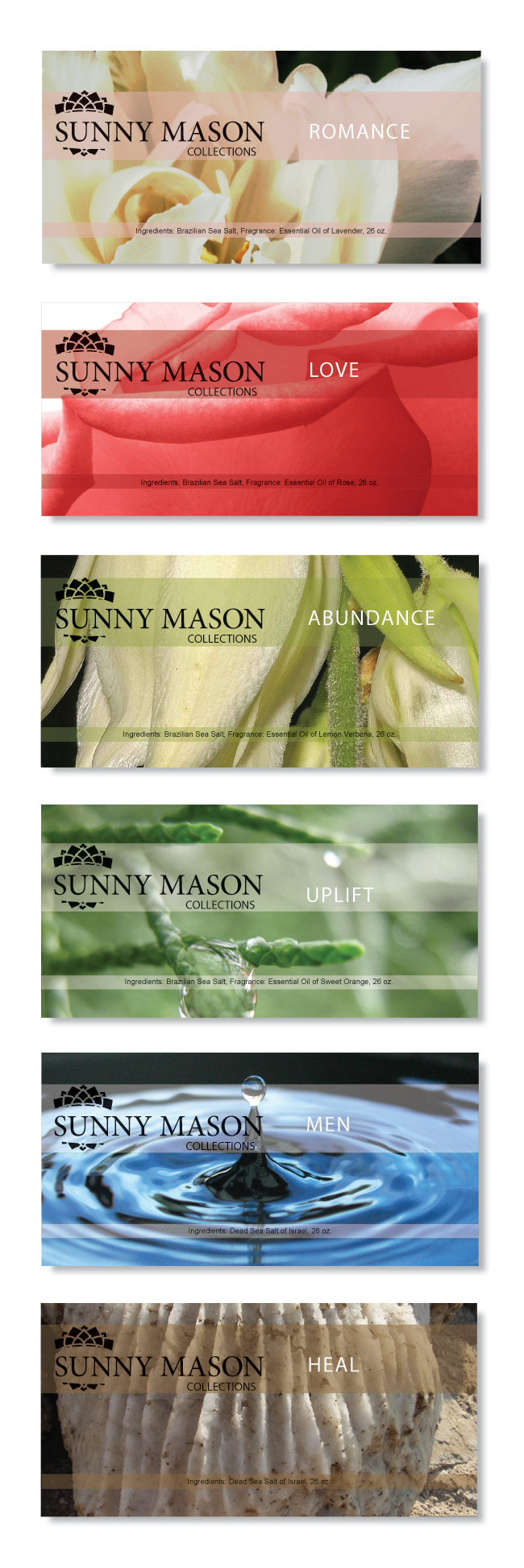
Sunny Mason approached me about creating an identity as well as packaging for her healing bath salts and scrubs. Healing and energy were two strong influences Sunny wanted to remain with the brand. The logo concept is derived from the Hindu symbol of a chakra. The packaging for the Salts and Scrubs are represented through nature photography.
Creative Direction | Logo and Identity Design | Packaging